| Home |
| Top Ranked |
| Places Map |
| Real Estate |
| Compare Places |
| My Great Place |
| Places Data |
| State Data |
 |

|
GreatPlacesToRetire |
|

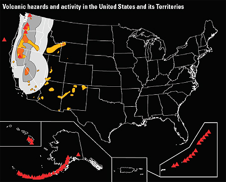
This map shows historical volcanic activity and its hazards over the past 10,000 years in the U.S. Red triangles represent volcanoes. Light orange areas have lower volcanic hazard while dark orange means higher volcanic hazard. Light grey areas have lower ash fall hazard and dark grey areas have a higher ash fall hazard. Sources: USGS, National Atlas.
| Terms & Privacy | Site Map | About Us | Sources | Links | Advertise | Revised: 12/13/2018 Copyright © 2019 Great Places To Retire |